Whenever I was working on the design of a website, first thing I started with was the location and size of the logo. On the one hand it might be a bad habit, but on the other hand it’s one of the most important elements in terms of building a brand. If it’s a tailor-made website, it is basically the element from which the whole process of design creation can gradually unfold.
But what if you’re creating a universal template for a system that lets hundreds and thousands of users create their own websites? Each and every user wants their logo to be shown nicely, clearly and in the right place. The logo defines the identity of the business.
And here arise first complications:
Logos have different formats. They can be wide, narrow, squarish, round, tall, low… all kind of. With all these options, there are certainly more suitable and less suitable formats, but exceptions from such rules can bring benefits too. It has therefore become common practice not to limit the size of this element in a strictly prescribed format and let users to deal with it on their own. This usually results in the broken website design or subsequent problematic changes in the responsive design.
However, this is not something that we were willing to accept in the Pixenio project. This project has an ambition to eliminate all the problems in the website creation process, even those encountered by a regular user. So we tried to define a few universal rules to achieve the best result.
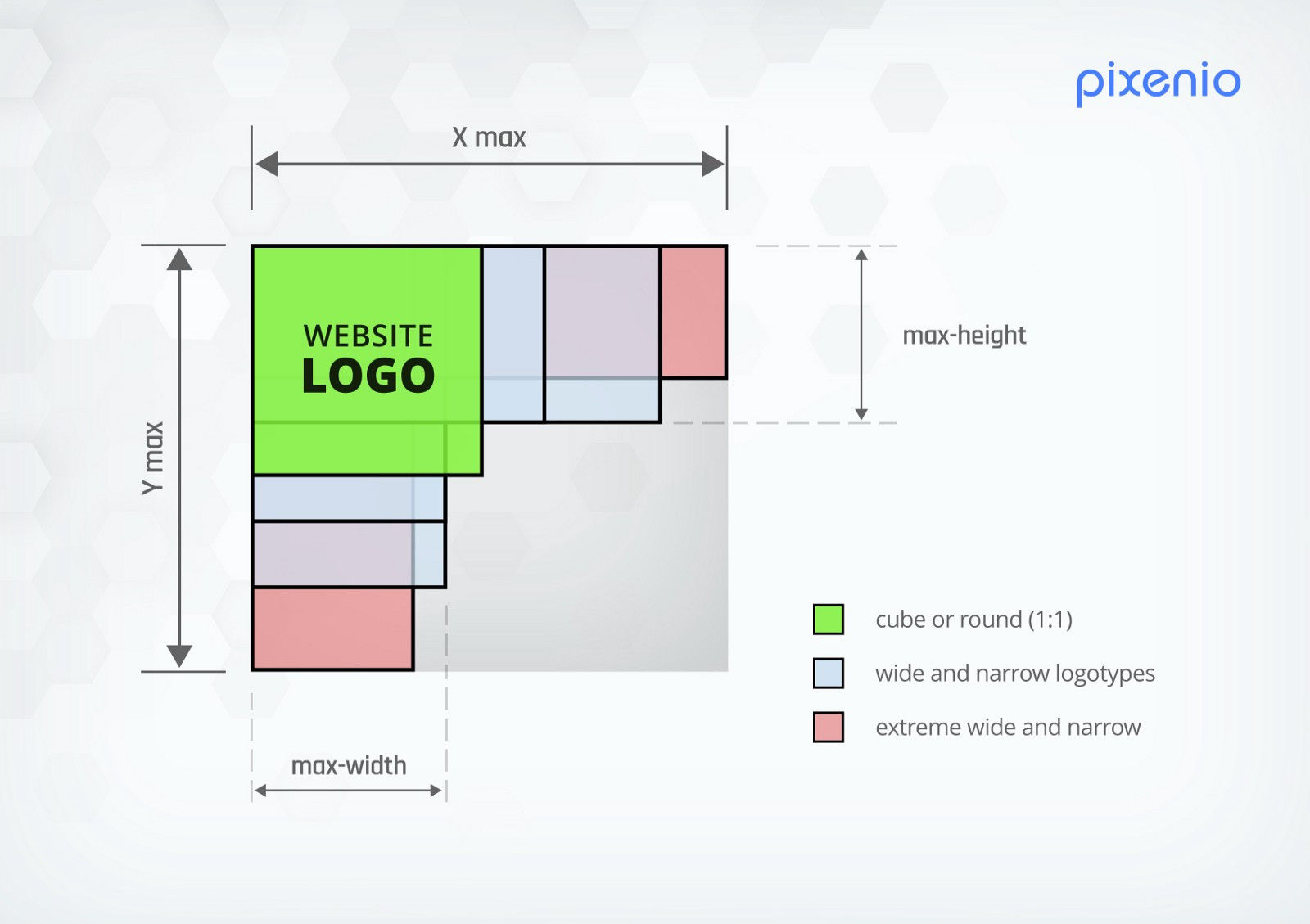
1. Logo must be suitably large in any format. It must not look too small or too large with respect to its environment. Translated into a mathematical theorem — the area size of one logo format should be approximately the same as the area size of other logo formats.
2. It is necessary to define boundary values. Why? Simply so that you can work effectively with the space around the logos and appropriately set up the layout changes for the website’s responsiveness. In this respect, the predictability of its dimensions is extremely important.
3. Logo can shrink or adapt as it is, but it cannot be cropped or deformed in any way. We wouldn’t make anyone happy by doing this.
4. The most important rule: the result must look nice :-)

And what do we want to achieve? Simplicity. User should not be bothered with the settings for such a web element, which is important on one side, but it is not user’s expertise to work on it and waste effort. Once the logo is uploaded by the user, we want to let user to focus on the most important part of the website — its content.
If you know a more suitable solution, I welcome any suggestions for achieving a better result :-)


Add a Comment