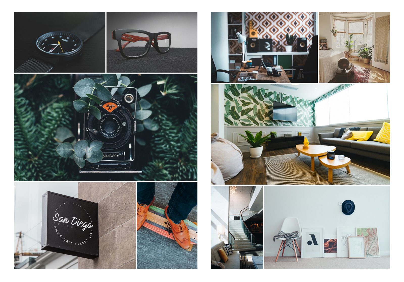
Tom Tom is the first theme I’m building at Pixenio. It was designed with photography and creative industry in mind. This fact had a great impact on gallery layout.
There are many ways to showcase pictures and photography especially. With the first theme I opted for layout where is no manipulation with the image itself. No ratio change and no cropping, while design as a whole is still attractive.
Behold the justified grid ™
During the design process, I wasn’t actually aware that this layout is called by any names. I designed it just the way I felt it’s right. Just before code part I started to realize what doom I brought upon myself.
At first, it wasn’t clear this layout won’t be possible to create with flex-box, nor css grid. Problem is, that images have different ratios and I was maintaining no whitespace but single gap. This way images on the same row have the same height and are distributed on the row stretched from the start till the end with original ratio and without cropping. Such as justified align for text. That’s where the word justified comes from.
Then I realized that it is the layout many photo-banks use. But still, I was failing to find any existing, modern and reliable library.
At Pixenio, besides we are really picky about 3rd-party libraries, our biggest premise also is, that website should look with any or almost zero data as good as with plentiful of design grade content.
To keep our premise, I opted to create custom solution which I call justified grid. By the way, this is also the reason that masonry grid was not the option. In contrary, justified grid does not have restricted number of columns such as masonry has. Because layout is divided by rows, not by columns. For example, you won’t get attractive results from 3 narrow images in 2 columns and many other cases. Well, at least not in Tom Tom.
Example of the same images in both layouts:
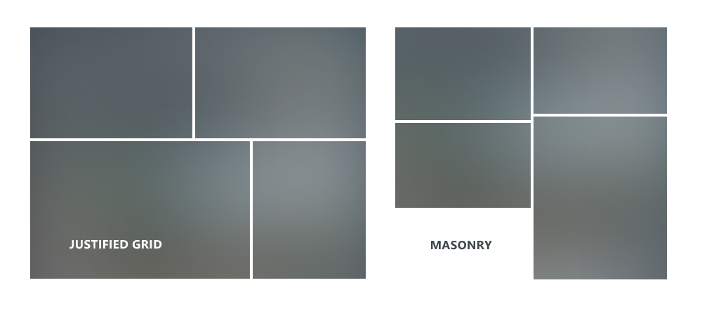
No matter how great justified grid sounds, I am aware that we can’t apply this solution to every theme from now and on, but for the first one I think it’s the best. At least until we have another artist-centric themes with different layouts (masonry including) which still, many might prefer. ;)

Add a Comment